The purpose of this HRSD Brand Guideline is to ensure HRSD is presented in a consistent and professional manner. If questions arise regarding usage, or if another file format is needed, please contact us.
HRSD Logo and Tagline
The HRSD Commission adopted a new logo and tagline in December 2024 to better reflect HRSD's 2030 Vision Strategic Plan and align with HRSD's updated Promise and Vision. It also presented an opportunity to refresh the HRSD brand, seeking a more current and dynamic design to align into a house of brands with HRSD's sub-brands (SWIFT, SWIFT Water® and NutriGreen®) for better recognition.
Qantm Creative was selected through competitive RFP process to lead this effort, which included several workshops and meetings between Qantm Creative and an HRSD team comprised of staff from all HRSD divisions, external in-person focus groups, and employee surveys.
Name
We refer to ourselves as HRSD in all communications. The name "Hampton Roads Sanitation District" is used only as required in legal documents.
Tagline
The tagline, "Sustainable, Innovative Wastewater Treatment" was chosen by HRSD employees and approved by the Commission. It reflects HRSD's Priorities, Promise and Vision and aligns with HRSD's core values.
About the Logo Design
The refreshed logo introduces a third color, a bluish purple (blurple), which was chosen to communicate HRSD's commitment to innovation and technology. The three-color icon gives a nod to the various water bodies in our service region and visually reflects our core value of helping communities thrive with clean water.
-
Use of the Primary Logo with Tagline is optional for promotional materials. This variation of the logo should not be used in a size that makes the tagline illegible. This variation also should be positioned so there is adequate space between the logo and any text beneath it.
-
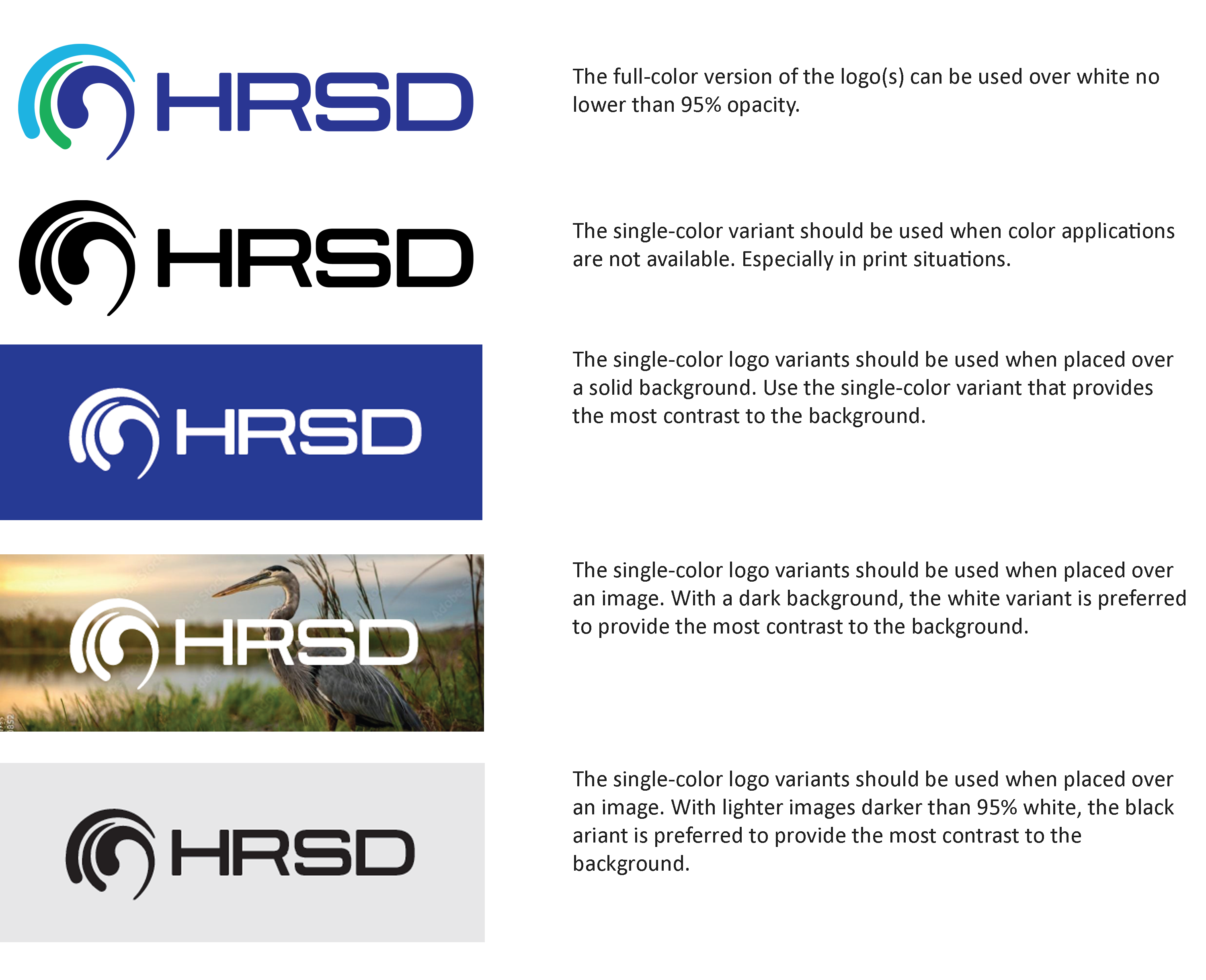
When multi-color printing is impractical, such as in black and white newspaper ads, a single-color variation of the logo should be used. This is preferred because the three-color version appears in unattractive shades of gray when used in a black and white publication. The color should be 100 percent black when printed on a light-colored background, or zero percent black (white) on a dark background.
Use of the Single-Color Logo with Tagline is optional for promotional materials printed in only one color. As with the Primary Logo with Tagline, this single-color variation of the logo should not be used in a size that makes the tagline illegible. This variation also should be positioned so there is adequate space between the logo and any text beneath it.
-
-
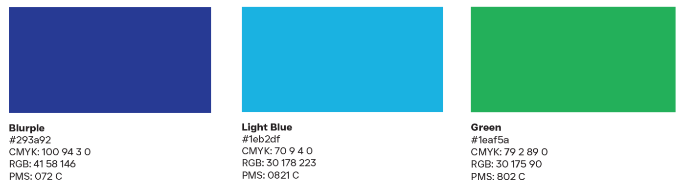
The HRSD logo includes three colors. No other colors may be substituted.
-
The logo must be resized proportionately. If the logo is resized vertically, it must be resized horizontally by the same percentage of the original logo size. The logo should not be rotated, reversed or inverted. The logo should not be sized below 1-inch wide for print applications, or below 100 pixels wide for digital.
-
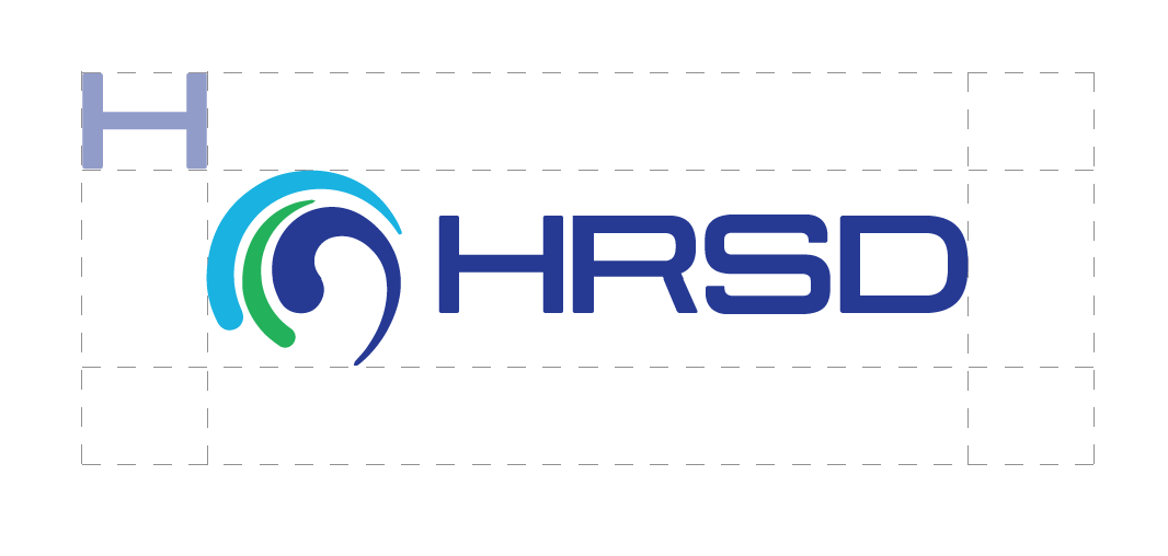
To ensure integrity and visibility, HRSD logos should be kept clear of competing text, images, and, graphics. They must be surrounded on all sides by adequate clear space. For the logo, that is equal to the "H" height from the logo.
-
-
Protect the integrity of the HRSD identity by avoiding improper usage in the examples below:
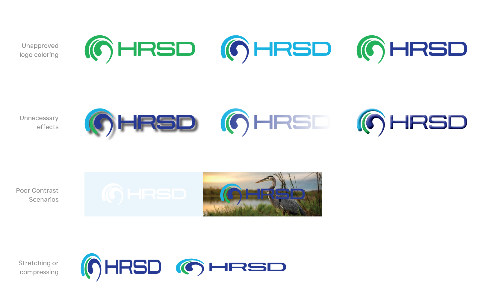
The consistent arrangement of the HRSD logo with or without the tagline is fundamental to effective communication and should never be compromised. Always reproduce the logo from the original artwork, available in the download section.
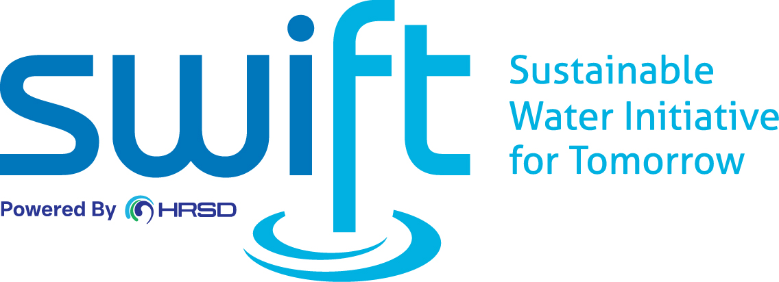
SWIFT Logo and Tagline
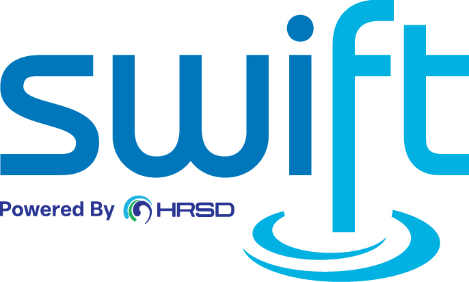
The SWIFT logo is available to use with, and without, the full name of the initiative.
-
When multi-color printing is impractical, such as in black and white newspaper ads, a single-color variation of the logo should be used. This is preferred because the three-color version appears in unattractive shades of gray when used in a black and white publication. The color should be 100 percent black when printed on a light-colored background, or zero percent black (white) on a dark background.
-
-
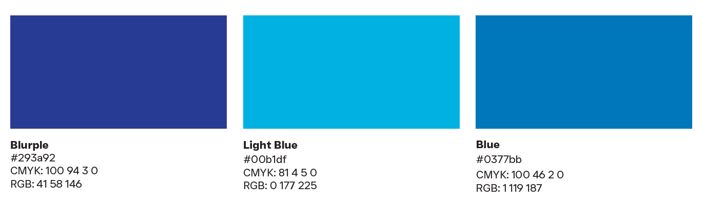
The SWIFT logo includes three colors. No other colors may be substituted.
-
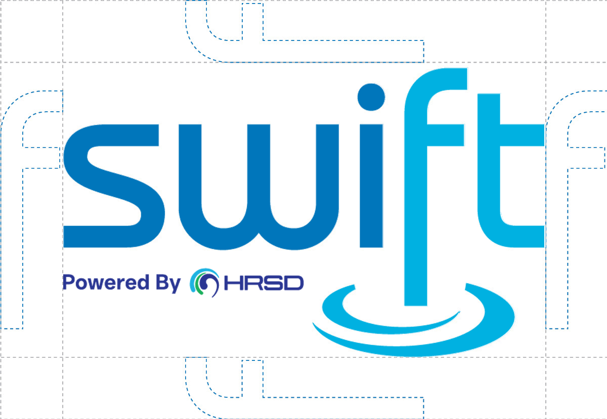
To ensure integrity and visibility, SWIFT logos should be kept clear of competing text, images, and graphics. They must be surrounded on all sides by adequate clear space. For the logo, that is equal to the "f" width from the perimeter of the logo.